Monday, 25 April 2011

Evaluation 4

Software/Research/Equipment Usage 


From the Beginning of my research to my finished Digipak and Music Video I have used a range of different software programmes. Firstly Adobe Photoshop which I am grateful for having at home and at college. I used this to design my Digipak, flyer and an animatic draft of what I wanted our music video too Look Like. Secondly I have used Final Cut, I used this to edit our video numerous amounts of times rough and final. We took advantage of the programme by using it to our potential. Using key framing,  many transitions, smoothing, slow motion, lip syncing, filtering and applying cuts where needed. Yes I have learnt some new skills making this music video which I didn't know. For example, having 3 clips playing on the same screen at one time, playing a transition over another and changing filters to get different types of styles for example 'old film' '60s' etc. 

I have used Blogger to post all of my evidence, planning and creating I have been doing, I did use Tumblr but I switched over as it was too slow and kept crashing. I have used youtube to gain information into music videos and different styles of editing, camera angles and filter styles. This has helped me gain skills and ideas which I probably wouldn't of thought of with using it. In my research I used wikipedia to find out about Britpop Culture and origins. I didn't use this to much because various parts of information was false. But again this did help me to find out bits and bobs. I used Facebook to gain feedback on my designs and music video, it was a good idea because people could just post on my designs and tell me what they thought and I could improve them... 

We used One Hd Camera, One macbook and one spotlight to make our video. Doesn't seem like much but it did the job perfectly fine. We took the HD camera out and played around with different filters to see if we could get what we were aiming for, which was a black and white, half lit kind of style. We also tried out different camera angles to see which ones we could use in the music video. Lastly I found out how to light a music video again a big thank you to youtube for the tutorials on there. 


Evaluation 3

FEEDBACK  


We received feedback from many different people and places. The most popular choice of feed back was 'Facebook' we simply created a group and let people talk about the good and bad of our music video. At first we started to get little bits of feedback like "I like the colour" or "Love the guitars" That wasn't really helpful so we invited class members to join the group because they have just made a video, therefore all the techniques are fresh in their minds. Secondly we then showed our rough cut to the class and they could tell us what they liked and didn't like on paper... A lot of people like the smoothness of the opening shot how the camera lifts to the singers face as he moves into the shot. And the filters and lighting we have used gave a really nice effect. We did how ever get a few negatives about the transitions and that it's just the same shots of a band playing. So we decided to go a shoot some more footage and add them in.

Our Teacher gave us so constructive criticism which we could change before the deadline. He said "I really like the effect you are giving off but you could get some more camera angles of the singer and the band together playing. And film some rough cuts somewhere else to give it more location variety". We thought about this and we did shoot some rough cut footage but the tape broke when we were trying to upload it. There fore leaving us with no new footage. So we decided to play around with motion key framing to give it a better look. We did however manage to get some extra footage of The bassist and the guitarist standing in front of the union jack not just playing but laughing and messing around like bands do. I think this helped lighten the mood towards our music video.

Evaluation 2


Ok so here is my album cover front and back followed with shots from the music video. I feel that this what you would expect with a cover like mine and my reasons for saying so are as followed. The cover of the album is black and white and quite simplistic with the designs. And the video is in Black & White and looks very simplistic (It wasn't actually simple to film) The album cover is also creative and we got some really creative camera angles for example, the canted angle of the bass player, the side on close up of the singer, the crane shot of the drummer and the extreme close up of the bass player in the video. And the britpop theme to the cover is also continued into the music video through the home made union jack which is in the background of the shots and lastly the clothing of the band are quite smart casual like most Britpop bands.

Evaluation 1 Part 3 Continued Poster

 This is my advertisement poster to promote and sell the album. I tried to keep things simple with this poster by keeping the same design of the album cover. But adding things that you would see on a poster. For example the review by an official music magazine company. People won't want to buy it if it's had no reviews. Secondly I added where you can get the album from and on what date. Because without that people won't know where to go to get it or when it's coming out. I have added the record company that are promoting this album. And a website where you can find out more about that album/band and pre-order to receive exclusive album content etc. In comparison with other advertisement posters for the same genre are a bit different but information wise they are the same. For example, this strokes poster, ok it's not physically the same but it has all the same basic information, the release date, where you can get it, the record label, reviews. So overall I feel that My poster is a believable advertisement. 


Evaluation 1 Part 3 Continued


The influence for the back of the album cover actually came from the front of 'The Specials' album cover. Hence the black squares and the two different colours. I wanted to make the back of the album cover quite simple. And not to complicated. I managed to fit everything in included the 'Copyright, barcode and record labels' I think the two colours make the genre easy to guess and doesn't over complicated the eyes. If I was to change anything about the front of my album cover I would of done the background in black & white. For example on this album cover they have shaded one side black and the other white.

Evaluation 1 Part 3


This is my final front Digipak design. My inspiration for this chosen design comes from many different other Britpop band. For example the Libertines really gave me some influences on the text with the cut out style title text. The cribs also use the same style in the text. The main image I created is the man, now the influence behind that was the blur album cover. I wanted the same style as that but without the colour so I drafted a few ideas and came up with that. Then I felt it needed some britpop relevance so I added the splashed Mod symbol to his T-shirt. So overall the similarities are the text from 'The Libertines' Album and artwork from 'Blur' album.


Evaluation 1 Part 2

Similarities With Real Music Videos 


I have chosen 9 frames from different music videos, first being Picture 1 from 'Life In Film' the reason I picked this is, the lead singing is really feeling the emotion on his face when he is singing perhaps relation to something personal beneath the lyrics. Secondly the shot of him singing and how his face is lit , is how we lit our music video and pretty similar shot. Picture 2 from 'The Libertines' I picked this because it shows the genre Britpop straight away by the jacket he is wearing which is the typical Libertines style in most of their videos also it shows some band 'Banter' like you expect in all music videos. We wanted to capture this in our music video.

Picture 3 is taken from 'One Night Only' this shot shows a typical Britpop kind of scene with the Taxi going past him in the background, haven't got a lot of money to spend on the video so Handheld in the street. I like this shot because it's a really good music video and so simple. Picture 4 from 'Oasis' I like the shot because its got a similar filter to what we have used with the contrast balance. Picture 5, 'Cage The Elephant' Uses a good range of filters for example that 60's style filter which gives a really nice effect to the video, we were thinking about using this on our video but we decided on doing it in Black & White. Picture 6, 'Kings Of Leon' again really like the 60s style filter. Picture 7, 'Linkin Park' This has all of the things we used in our music video, the lighting is pretty similar, the filters are quite dark and colour reduced. There is also some slow motion and fast motion in this, we used slow motion in our video. The singer is singing from the girls perspective and not the boys slightly different to ours.

Picture 8, 'Life In Film' this shot of the drummer is like ours, we tried to get this effect because we thought the tone of colour and light was really nice and the filter worked really well, this video was probably the biggest influence on Music video. Picture 9 'The Kooks' they use a range of different filters in this video and the lyrics refer to a girl as he says "Ooh la, she was such a good girl to me" we have used some of the same effects and filters in this video and the lyrics are about a girl as are ours.

Evaluation 1.

PICTURE 1 


This shot of the lead vocalist/guitarist demonstrates the feelings and story behind the words. For example singing about a girl who he thinks he must be in love with because of all the antics which are going on between them. (The petty things picking what's wrong with each other that they want to change). Also the facial expression of the vocalist/guitarist shows that he's thinking about what he is singing. Therefore linking lyrics to visuals. The colour of the shot also shows how he is feeling for example, there is little light that shows he is half happy and half not.


PICTURE 2 


This shot shows a Britpop band laughing, playing music and sort of doing things by themselves. Hence the home made Union Jack the ordinary clothing. This is how a record company would want a band under there management looking. Happy, cheerful and doing what they love.


PICTURE 3. 


This picture portrays are genre in the simplistic of ways. For example the British flag behind the guitarist shows the kind of genre, along with the white shirt and red guitar. All good Britpop songs have good guitar riffs and solos. And I think that we captured that in this shot. Also it looks very DIY (Do It Yourself). Which is what we did.


PICTURE 4 


This shot shows intertextual reference to a music video we followed a style for. 'Life In Film, Sorry'
We tried to capture the same style of lighting as they did. How the light reflects certain parts of the drum it and face. The black & white filters also shows many intertextual references from videos I have watched on the Internet.


PICTURE 5 


We really thought about our camera angles and how we were going to make it look 'good' we caught a really nice shot here of the camera looking down the bass. Which I feel is really artistic and makes the bass playing look really cool. We tried to capture as much good angles as we could throughout the video. But I think this one was the best one we caught.


PICTURE 6


This picture demonstrates our lighting. And what you can see is we didn't have much... One static spot light. But I guess this is all we need because it did the job perfectly fine and we managed to get the effect we were going for. We changed the light to different positions and sometimes hand held it so we got the light where we wanted it.


PICTURE 7


I really like this show because it shows you that we didn't use a lot of equipment. Fair enough we have our guitars but we are both in bands and we use them for own use. But the flag and clothing were all just casual. We didn't have a budget to make this music video therefore we used what we had and what we could make. But I think we used all of that to the best of our ability and constructed our ideas well.


PICTURE 8/9


Both Pictures 8/9 show we have watched other music videos for example, the camera angles show that we have picked up knowledge from other music videos to of gathered this idea. Secondly The clothing shows we have seen videos of the same genre and picked specific clothing and style. The close up of the singers face shows we have have watched other music videos because we would of probably shot it from the front and not the side. But overall I feel what mainly shows we have seen other music videos is our choice of the black & white filter and the specific lighting. It shows we have researched, constructed and adapted on other videos which I am very proud of. Also it shows we
we have listened to the song so we could play in time with it and sing the words.


Monday, 4 April 2011

Fall Out Boy Analysis

Fall Out Boy - Analysis 
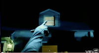
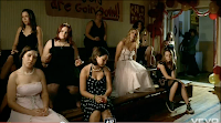
There are four different locations in this music 
video which makes it more realistic and gives it
a narrative which makes for a more believable 
music video. The first location is at the typical 
american girls house ready to be picked up for 
'Home Coming' . The second location tells the 
audience what the boy is throwing rocks at the 
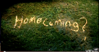
window for and again to tell us that it's home -
coming and her 'date' or boyfriend is here to 
pick her up. The third shot we see is the boy 
and girl talking to each other making sure they 
both look good before they enter the building. 
Again this shows some realistic narrative about 
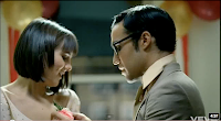
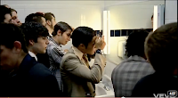
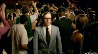
some high school teenagers. Then they enter the 
hall where the crowd and band are playing etc. 
Then it starts to contrast the genres of different 
types of people there. For example the pretty -
popular people, the nerds and geeks. This is 
shown through mise - en - scene for example, 
the kinds of clothes they are wearing and the 
way they portray there actions differently to 
others. The forth location are the boys in the 
toilets touching themselves up, for example 
there hair and smell etc. Which is rather 
optimistic because normally you have the girls 
in the toilets re-doing make-up, hair and scents. 
I guess this portrays that the boys are just as 
conscious about how they look as well as girls. 
Again showing realist narrative. Throughout 
the 4:38 length of the clip there are, 222 cuts 
which make corresponds with the BPM which
is about 1.8. Again making the video 
believable with the audio. The different kinds
 of shots show emotion and builds up the 
atmosphere for the song. The pattern of editing 
tells a story about what's going on and typical 
scenarios that would happen throughout a night 
like this. The music has some relevance to what 
is going on and the actions people are giving. 
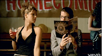
For example, at 2:48 minutes in he says "Why 
don't you show me a little bit spine you've been 
saving for his mattress. This is referring to the 
girl dancing in front of the geeky looking boy. 
From this video I have learnt to try and tell a 
story with our music video because it keeps the 
audience entertained and watching....  and it does
help to have good actors, props and narrative to
go with your video because it makes it more
believable and fun to watch. Also try not to let
it all be about the music because in this video
they have people talking which makes it a good
story to go with the music video. Lastly to edit
in time with the beat and at relevant points. Try
not to make it jumbled because it won't be easy
to watch for the audience and this could lead to
music video not being as successful and hard to
watch. There are not really any jump cuts in this
video which doesn't make it look out of place or
un- believable.